Zelenberg, at a glance.
Zelenberg is a specialized B2B marketplace for agricultural inputs and equipment from China. Buyers find manufacturers our team has visited, and can add our services to any order.
Everything in the Zelenberg brand follows from one job: giving a buyer enough facts to start work with a factory they have never met.
- Team experience since
- 2006
- Hangzhou and Hong Kong
- Two offices
- Evidence words
- Visited, Confirmed
- Working languages
- Six
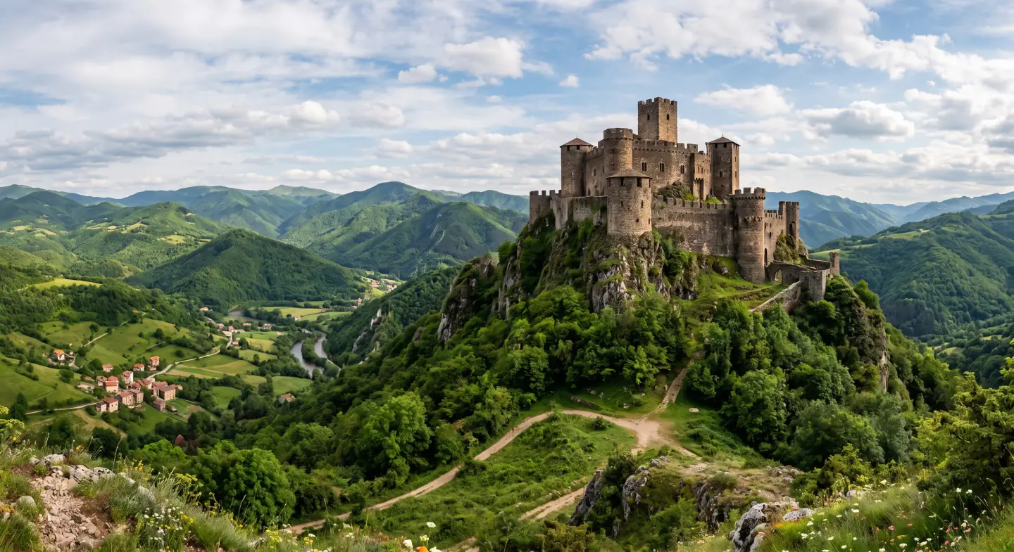
Zelenberg means a green stone castle.
Green
Green stands for agriculture, growth, and health, and for the responsibility we share toward the future. It reminds us that the work done in this industry supports life.
Stone castle
A stone castle stands for strength, stability, and a dependable foundation. It is the marketplace we build: one place where useful information, experienced manufacturers, serious buyers, and specialized services come together.
Together
Together, these ideas describe the character of Zelenberg. It is green in purpose, strong in foundation, and open to people who want to contribute to the future of agriculture.
Written
Zelenberg
Said
[ZELL-en-berg]
How to say it and write it
Zelenberg is said Zellenberg. The L is short and doubled, as in zell, not a long zeal. Three parts, even stress: [ZELL-en-berg].
It is written as one word, capital Z, with no space and no hyphen. The spelling keeps a single L even though the sound doubles it. It is never shortened to Zelen or ZB, and it is set in capitals only in the logo.
What we stand for.
The promise is the sentence we defend in public. The mission says why we exist today. The vision says where the company is going. Marketing copy may rephrase the promise, but never the meaning of these three.
Our promise
Real Manufacturers, Serious Agritraders.
Four words that work as a filter. Real manufacturers is our supply commitment: factories our team has visited, and no traders in disguise. Serious agritraders is our demand commitment: buyers with real intent.
Mission: why we exist
To bring experience and new ideas into one specialized B2B marketplace for agricultural inputs and equipment. Buyers find manufacturers our team has visited, the details they need, and services for local support. Agriculture affects human health, and that responsibility guides our work.
Vision: where we are going
To be the specialized marketplace that buyers of agricultural inputs and equipment use for the whole purchase, not only the introduction. A place where buyers and manufacturers work together, and where new products and methods in every category find room to grow.
Six values, each one a choice.
A value only counts when it rules something out. Each of these six carries a cost we accept: fewer listings, slower onboarding, a longer sales cycle.
Responsibility
We describe our work accurately and respect the people affected by agricultural business.
Specialization
We organize products, information, and requests around the needs of this one industry.
Clarity
We explain costs, roles, and the next steps before any work starts.
Cooperation
We make communication useful for both sides: the buyer and the manufacturer.
Learning
We share industry knowledge and practical ways to develop an agricultural business.
Innovation
We introduce new products and methods only with specific information behind them.
A mark and a wordmark.
The Zelenberg logo is a mark and a wordmark. The mark is two arrows locked together, and they close into a hexagon. The wordmark is the name in capitals, supplied as outlines. Both are used only as supplied artwork: never redrawn, retyped, stretched, or recolored.

Color masterOn white Color masterOn warm grey Color masterOn app grey 
Reverse masterOn deep navy
Using it
Scale it uniformly and keep it level. Use the horizontal lockup when the space is wider than it is tall, and the mark alone only on square or very small surfaces. Use the reverse master on dark surfaces, and the mono master, black or white, for one-color printing. Never separate the two arrows, change their 50° angle, or retype the wordmark. If a background is neither clearly light nor clearly dark, switch masters rather than adding an effect.
Navy carries the request. Green carries the goods.
The mark is two arrows locked together, and the gap between them draws a Z. Navy carries the request and the record: the buyer’s RFQ coming in, and the name that stands behind it. Green carries what is grown, sourced, and loaded: the goods going out. The two arrows always keep their own colors. They are never swapped, never separated, and never used one without the other.

- The navy arrow: requests in
- The upper arrow brings the buyers’ requests, their RFQs, into the Zelenberg marketplace.
- The green arrow: goods out
- The lower arrow is shaped like a hull. It carries the goods to the buyers’ countries.
- Six sides
- The outline is a hexagon. Each side stands for one of the six marketplace categories.
Give it one X of room on every side.
The unit is X, the cap-height of the wordmark. Keep at least 1X of empty space on all four sides. Nothing enters that area: no text, no image, no rule, no trim edge, no partner mark. Because X is taken from the artwork, the zone scales with the logo at any size. Minimums are minimums, not recommended sizes.
- Screen minimum
- 120 px wide
- Print minimum
- 30 mm wide
- Mark alone
- 24 px / 6 mm
Blue is the surface. Green is the emphasis.
The identity is built on one blue hue. Navy carries authority across dark surfaces and headings, action blue carries anything clickable, and green is emphasis rather than a second brand color. The logo is drawn in two of these, not in colors of its own.
Brand navy
Headings, dark bands, logo
Deep navy
Footer, deeper bands
Action blue
Primary buttons and links
Accent green
Emphasis, rules, logo
Accent on dark
Green on navy surfaces
Warm grey
Marketing band background
App grey
Product canvas and sidebar
Body ink
Body copy, never pure black
Green rules
- Green text on white is or darker.
- Accent green is text on white only at 24 px and larger.
- Green text on navy is .
- Labels on green backgrounds are navy.
Body copy is dark grey, never pure black. On navy, green steps up to the lighter accent so the contrast holds.
Figtree, three weights, no decorative third.
Our typeface is Figtree, a freely licensed face from Google Fonts rather than a private commission. Three weights only: 400 for body, 500 for headings, 600 for display and buttons.
Arabic and Persian are set in IBM Plex Sans Arabic, and Simplified Chinese in Noto Sans SC. The calm comes from restraint in color and spacing, not from setting type so light that it is hard to read.
Display
Real Manufacturers
Heading 2
Factory visited on 12 May 2026
Body
Someone from our team was inside that factory, on a named date.
IBM Plex Sans Arabic · Right to left
مصنّعون حقيقيون، تجار زراعيون جديّون.
Noto Sans SC · Simplified Chinese
真实的制造商,认真的农业贸易商。
One badge, and it always carries a date.
The Visited badge is the only badge the Zelenberg brand issues. It says one thing: our team went to this factory on this date. It does not say the factory is good, safe, or approved. Color on light, reverse on navy, mono for print.

Color, on light surfaces 
Reverse, on navy 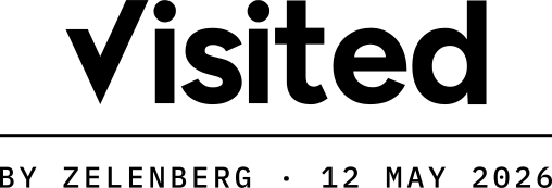
Mono, stacked, for print
Every badge appears with its date. The word alone is a claim. The word with a date is a record.
Six principles, and the rule behind each.
The plain-English standard
Every customer-facing sentence is written to be read by someone working in their second language, and to be translated without a footnote. Sentences carry one idea and average 20 words or fewer. Idioms and phrasal verbs are not used.
Evidence, not adjectives
Replace claims with proof. Not a list of adjectives, but a factory we visited on a date, with its business license confirmed.
Clear over clever
Our readers often work in a second language. Plain verbs, short sentences, no idioms. If a line needs a translator's footnote, we rewrite it.
Confident, never inflated
We write 'reduces risk', and we never promise that a purchase is safe. Honesty about limits is what makes confidence believable.
Calm authority
Around money, quality, and disputes, we stay calm. We state the fact, the next step, and who acts. Steady, exact, unhurried.
Respect the reader's seriousness
We write for professionals making real decisions, not for visitors to entertain. Every line gives them something they can use or check.
Curious about what is next
We follow new formulations, machinery, and agricultural science. We describe them plainly, with the evidence behind them, so buyers can judge for themselves.
Two words, and we never use a third.
Both words carry a date. A trust claim without a date is a sticker, not a record.
Two of these describe what we did. The third is the name of a service. Each one means exactly this, on every page and in every language.
- Visited
- Someone from our team was inside that factory, on a named date. It says where we went and when. It does not say the factory is good.
- Confirmed
- A registration document, checked against supporting records on a named date. For example: business license confirmed, 3 March 2026. It says nothing about product quality.
- AgroAgent
- Our managed-order service: one order, 11 defined points of supervision, from contract review to the final shipping documents. It starts after you and the factory agree.
Everything you need to write about us correctly.
A short description of the company, for the end of a press release. Use it as written.
Boilerplate, English
Zelenberg is a specialized B2B marketplace for agricultural inputs and equipment from China. Buyers in Latin America, North Africa, Türkiye and nearby markets find manufacturers that the Zelenberg team has visited. They can add six services to an order, from a Factory Visit to a Container Loading Report, or hand the whole order to AgroAgent. The Zelenberg team has worked in China’s agricultural trade since 2006, with offices in Hangzhou and Hong Kong.
See the standard in use.
Every rule of the Zelenberg brand appears on a factory profile: a visit date, a named document, and no word we cannot prove. The quickest way to check us is to look at one.